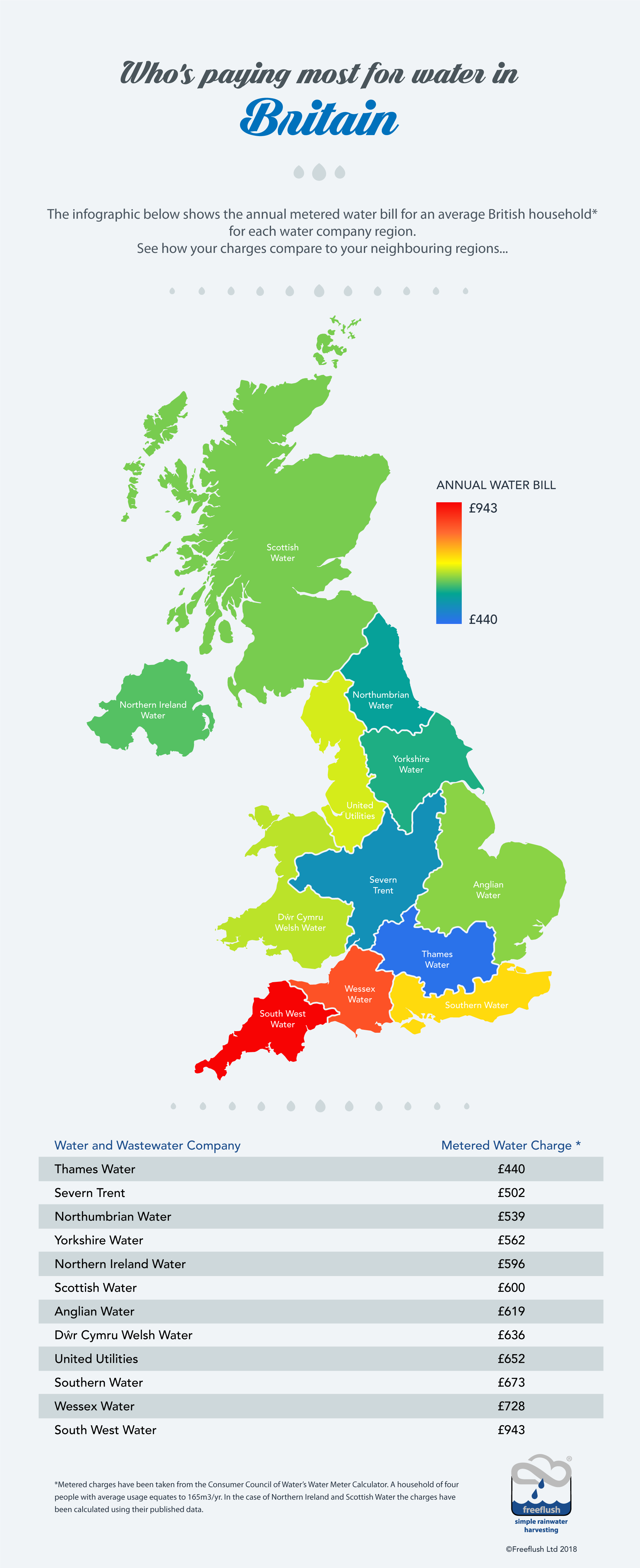
There are big differences in the amount you are likely to pay to your water utilities depending on where you live in the UK. That’s according to our newest infographic, we’ve brought together the average yearly (metered) cost for water for different regions and colour coded them into a useful map.
Infographic by Who’s paying most for water bills in Britain? An infographic by Freeflush Rainwater Harvesting
![]()


